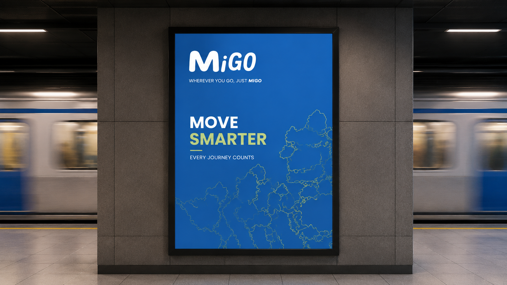
MiGO
For those learning, returning, or exploring, MiGO meets you where you are.
- Role
- Background study, problem framing, ideation, prototype, usability
- Tools
- Figma · Miro
Background
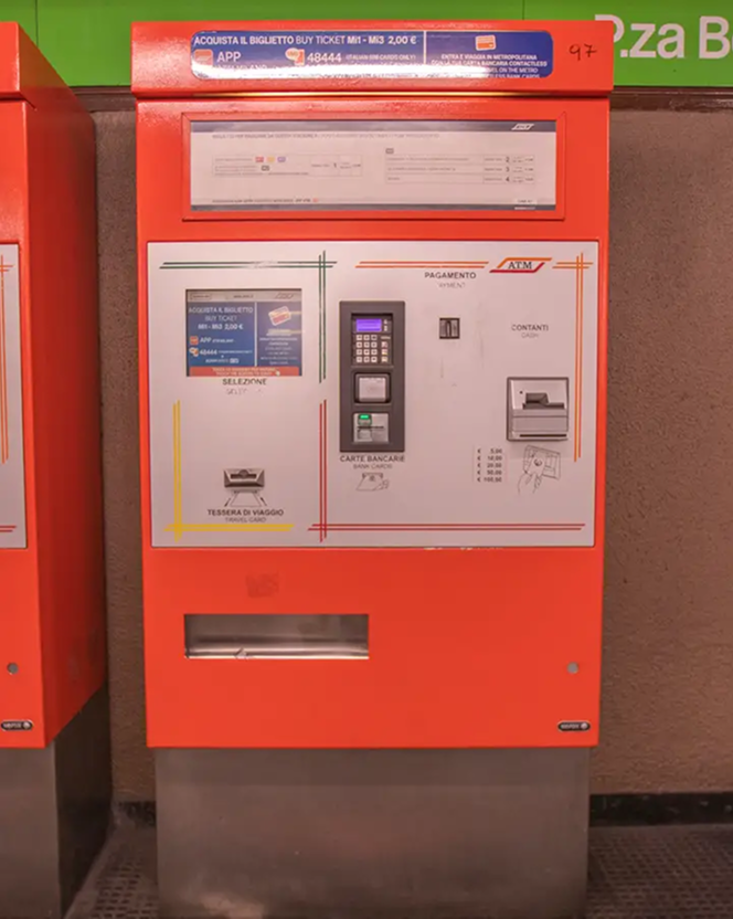
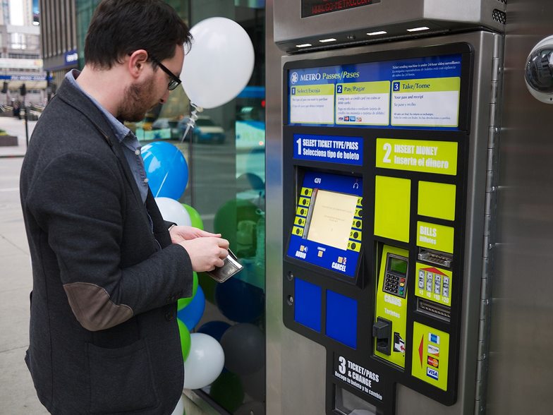
Commuters face frustration buying metro tickets and cards due to outdated kiosk interfaces, long wait times, and peak-hour inefficiencies, causing delays and confusion for first-time users.
Process
- 01
Background study
Observation
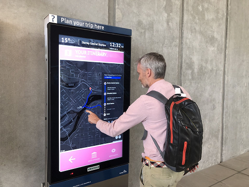
Desk research into metro and transit kiosk usability patterns, commuter behaviour, and how ticketing systems are structured.
- 02
Problem framing
Framing
Clustered friction points into option overload, wayfinding, and language.
- 03
Ideation
Sketched vertical and horizontal interface models against real journeys.
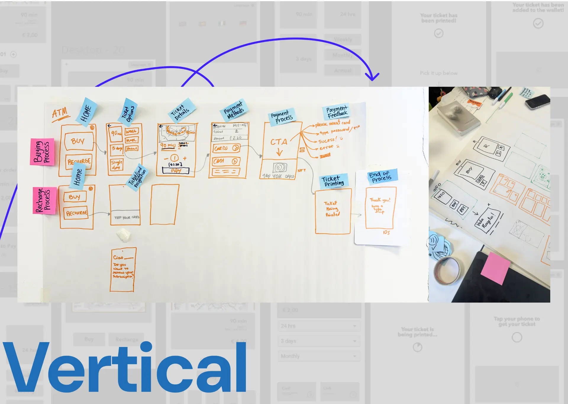
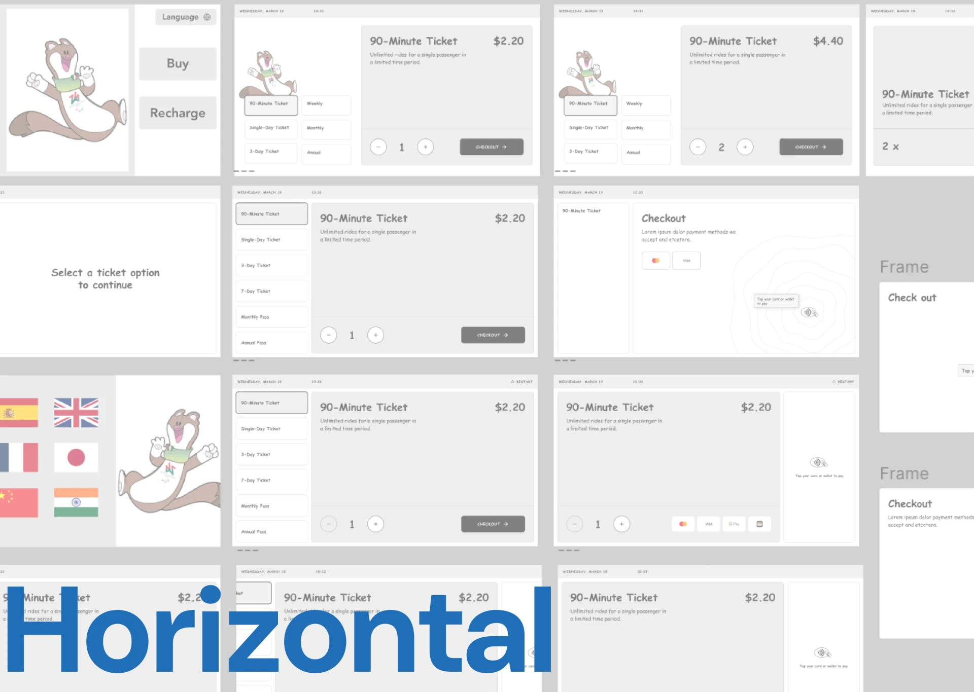
Interface exploration
Vertical vs. horizontal.
Vertical
More real estate, but poor contextual navigation.
Horizontal
Matches eye-level interaction and users' mental models better.
Testing
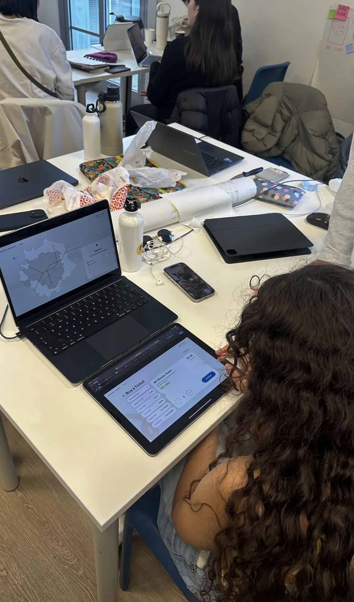
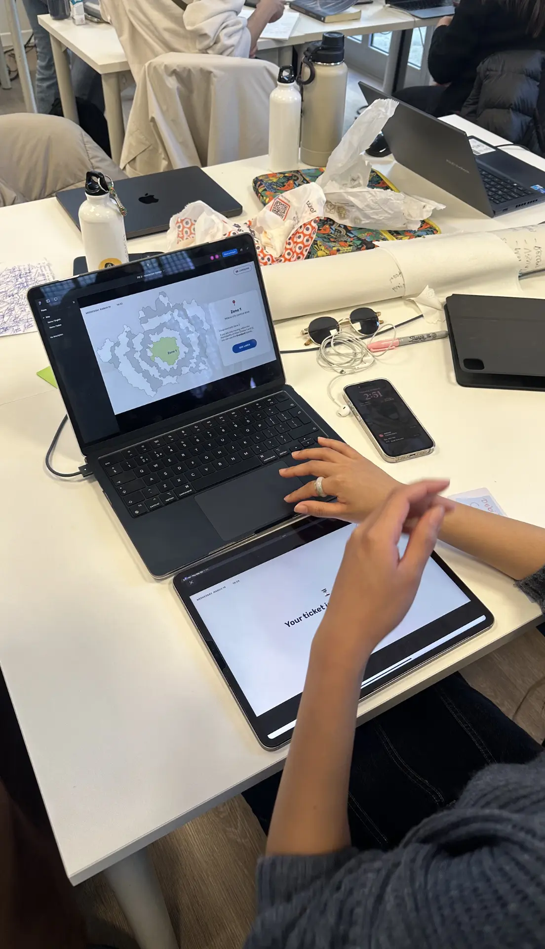
Usability testing.
Tested with newcomers, commuters, and tourists to sharpen the flow.
"Redesign the ticket purchasing experience to be more seamless, user-friendly, and time-efficient."
Personas
Three commuters, one kiosk.
Sofia
The newcomer, primary user.

Valentina
The frequent commuter.

Pierre
The infrequent tourist.

Pain points
- Overwhelmed by ticket options.
- Confusing kiosk interface.
- Language barriers.
- Social pressure from queues.
The idea
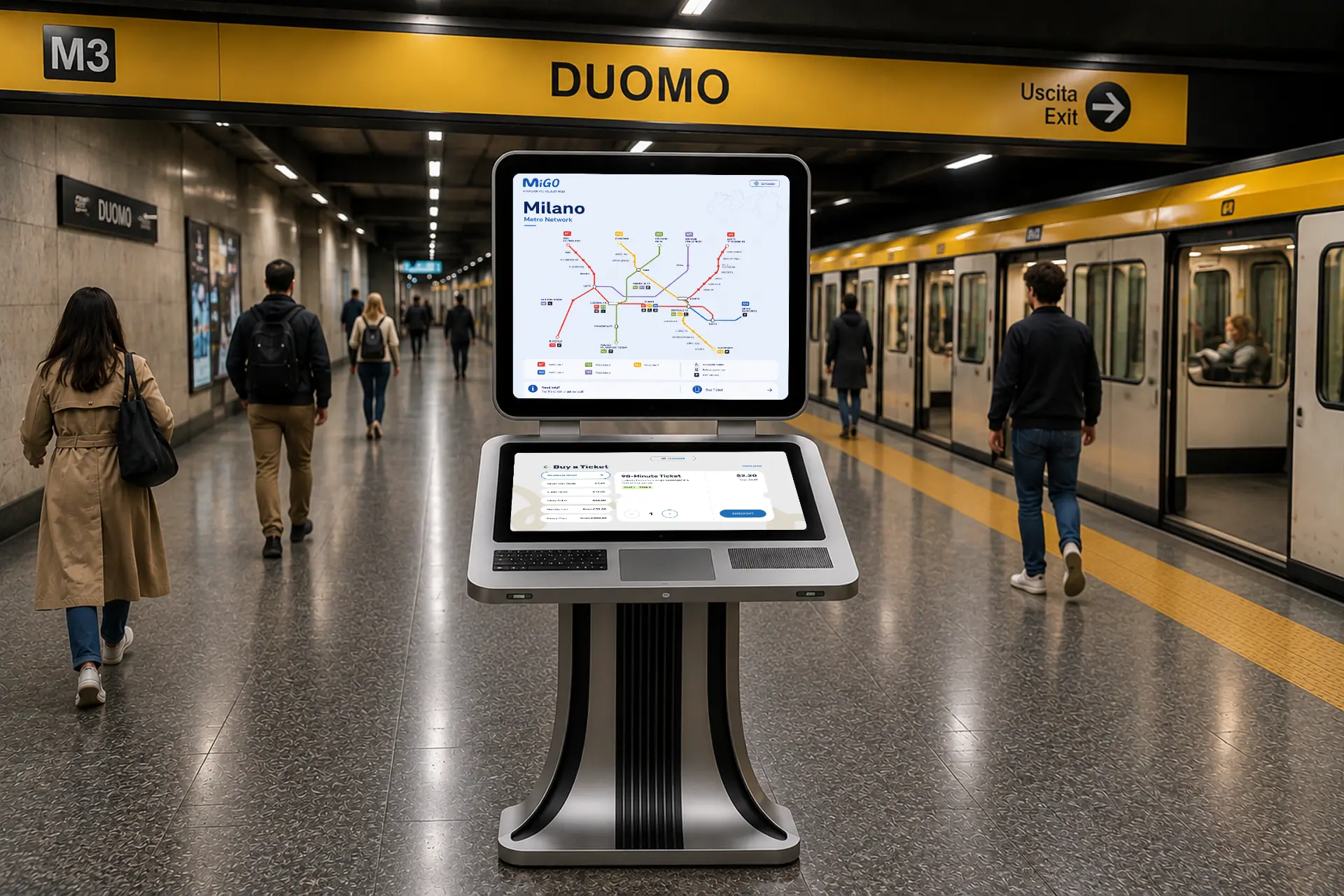
MiGO, two screens, one kiosk.
Combines vertical and horizontal interface elements into a single kiosk designed to make ticket buying less daunting. Prototype uses two LED interfaces.
Behaviors
What we encouraged, and what we designed out.
Encouraged
- Approachable
- Intuitive
- Interactive map
- Efficient
Discouraged
- Intimidating
- Clunky
- Information overload
- Confusing
Usability findings
- Unclear zone-based fare numbering for newcomers.
- Confusing terminology and layout for international visitors.
- Most users just want fast point-A-to-B routing.
- Users want upfront clarity on cash payment acceptance.